Mobile First Design Tips
Last weekend I released an updated version of my blog and website that share a similar design. I decided to go with a mobile-first approach when it came to the design, which is a tried and tested way to create responsive web applications. Along the way, I tripped up and made a few mistakes that cost me some time and rework, but could have been easily corrected had I had these tips beforehand.
Don't Forget the Viewport meta tag
More specifically, something like this:
<meta name="viewport" content="width=device-width, initial-scale=1" />I forgot about the first week of implementing my stylesheet. I won't say that all my work was lost after adding it, but it certainly tossed all the detail I had put into the design implementation out the window.
All modern designs have this header tag. You can read more about it on the MDN but, to summarize, it defines the width of your application viewport and the scale that it loads up in. Read through the section entitled A Pixel is Not a Pixel in the previous MDN article to get a better understand of this.
The important thing to know is that without this, you will feel pain.
Dev Tool Emulators are Your Friends
Edge, Chrome, Opera, Firefox, and Safari all have some kind of responsive design emulator tool to help make testing your code easy. Use it from the start, by selecting a pre-set responsive profile for the smallest device you care about for your web application.
This doesn't replace testing on an real small-screen device, but it definitely gets you moving on the development front.
Using the built-in emulators from the get-go enforces the mobile-first approach by ensuring that you start with the minimal amount of screen real-estate when building your application. As I learned, it is easy to get caught up in adding extra content because you think you'll have the space, which brings me to the next tip.

Start without CSS
No really, start without any styling.
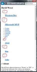
You might wonder why, but it really helps with understanding what "content" you're displaying. If you have a large number of elements on the screen that don't actually convey any information, you are probably making your application less accessible.
For example, if you have a lot of icons that are just there for asthetic purposes, you'll notice them a lot more in the plain HTML version of your site.
Not using any CSS also helps with the next tip.

Show ONLY The Bare Minimum
As you work on a page or a view, make sure you know what the bare minimum amount of content can go on the page to make sure it is still usable. Being more of a usability problem, it might be up to your designer or user experience expert to solve this problem, but it'll be up to you to develop and you'll be responsible for "fixing" the page when it's too cluttered if you don't have this information up front.
In my case, I wanted to display a list of blog posts. There is a lot of metadata for each post, but I needed to boil it down the bare minimum. From there, I was able to start placing the elements on screen and start sizing them. As I increased the screen size to test the responsiveness of my design, I added or changed the styling of certain elements to take advantage of the larger screen.
But how do you pick which screen sizes should be considered "larger"? There are so many devices with so many different screen sizes! -- You
Great question (and segway) into my next tip!
Steal Media Query Breakpoints
Although every project is a unique flower, at the end of the day the majority of our users are not. At least in the device sense. For this reason, I decided to start with the breakpoints defined in Bootstrap 3 and ended up using only a few them for what I needed.
I used a few of the queries defined in this forum post which helped me get my simple, yet responsive, design working on extra small screens and beyond.
>/*==========  Mobile First Method  ==========*/

/* Custom, iPhone Retina */
@media only screen and (min-width : 320px) {

}

/* Extra Small Devices, Phones */
@media only screen and (min-width : 480px) {

}

/* Small Devices, Tablets */
@media only screen and (min-width : 768px) {

}

/* Medium Devices, Desktops */
@media only screen and (min-width : 992px) {

}

/* Large Devices, Wide Screens */
@media only screen and (min-width : 1200px) {

}